
|
| · Ayu's Official Site · Ayu's twitter · Ayu's YouTube · masa's translations · Misa-chan's translations · |
|
#1
 27th March 2008, 03:24 PM
|
||||
|
||||
 [Pic] ASIA TOUR 2008 Logo OUT!
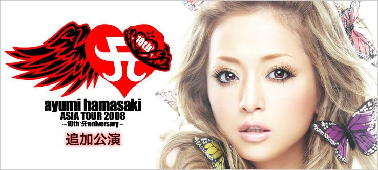 http://www.ticket-navi.ne.jp/a-ticke...80304-ayu.html It's taken from a-ticket official site  Credit: siupaul93
__________________
Last edited by babamon; 27th March 2008 at 03:27 PM. 
|
|
#3
27th March 2008, 03:30 PM
|
||||
|
||||
|
WOw! though it looks very "paintbrush"..(as in just used a photobrush paintbursh)..but Its nice!, a fresh A
|
|
#4
27th March 2008, 03:31 PM
|
||||
|
||||
|
NICE!!
Great lookin' logo as always!!  logo with a hat and a wing, i think it describe how ayu will fly all over asia on 1 wing but full of confidence (hat shows confidence, maybe ;D) logo with a hat and a wing, i think it describe how ayu will fly all over asia on 1 wing but full of confidence (hat shows confidence, maybe ;D)Thanks for the great info, babamon!!
__________________
Quote of Lifetime:"I don't have dreams. How can I say it? I myself am a dream."~浜崎あゆみ~ TIMEasia,March25,2002 
|
|
#5
27th March 2008, 03:33 PM
|
||||
|
||||
|
now u mention ONE WING...its rather Endless Sorrow...i hope she sings that (like in CDL0506)
|
|
#6
27th March 2008, 03:34 PM
|
||||
|
||||
|
That LOGO is really cool!
Very different!
__________________
|
|
#8
27th March 2008, 03:34 PM
|
||||
|
||||
|
^yes!! that one too!
I totally forget about Endless Sorrow..
__________________
Quote of Lifetime:"I don't have dreams. How can I say it? I myself am a dream."~浜崎あゆみ~ TIMEasia,March25,2002
|
|
#9
27th March 2008, 03:35 PM
|
||||
|
||||
|
the Heart is very (m)u
the wing is kinda I am... the Crown is kinda MY STORY-ish..classy lol
|
|
#10
27th March 2008, 03:38 PM
|
||||
|
||||
|
does anyone notice one thing, the wing is on the RIGHT side of the A logo! Is it has anything to do with 'ayu still has RIGHT ear' ?
__________________
Quote of Lifetime:"I don't have dreams. How can I say it? I myself am a dream."~浜崎あゆみ~ TIMEasia,March25,2002
Last edited by 4ever*ayu; 27th March 2008 at 03:46 PM.
|
|
#11
27th March 2008, 03:42 PM
|
||||
|
||||
|
Endless sorrow, but a little rockish feel. very nice
__________________
. . . be loved . . . . . . JEWEL . . . Instagram: Jalives  How tired I am of this unbearable distance between us. How I long for the toll of the recess bell. Have you forgotten me? Grown mindless of me? Tell me I am not writing into an abyss or that is what will become of my heart...
|
|
#12
27th March 2008, 03:44 PM
|
||||
|
||||
|
i kinda like it and kinda don't liek it..
i think the colors are a bit too heavy.. but let's wait... coz the goods design will be made with the logo.. so everyone.. let's wait ^^
__________________
|
|
#13
27th March 2008, 03:44 PM
|
||||
|
||||
|
Great! It's not some stupid symmetrical thing again! Wooo~!

__________________
|
|
#15
27th March 2008, 03:47 PM
|
|||
|
|||
|
i like it!!!!!!!!!! its so complicated i wonder how are they gonna utilise this logo..
i dont really like the fact that the one-wing theme was used in AT 2005 logo and the heart shape was used in AT 2006 logo.. so its like combination of both...
|
|
#16
27th March 2008, 03:48 PM
|
||||
|
||||
|
woah! I love it! ^^ thanks!
(tho for some reason, i thought that purple would b the main color in AT08 *shrugs*)
__________________
 thanks to georgiaannaa on LJ for the gorgeous YamaPi gif from Namie's UNUSUAL PV <3
|
|
#17
27th March 2008, 03:48 PM
|
|||
|
|||
|
This logo is going to look so ace on the t-shirts *________*
I love it Thanks for posting
|
|
#19
27th March 2008, 03:52 PM
|
||||
|
||||
|
i really like the crown
thanks for posting!
__________________
"Remember, don't let others dictate your music taste. If you like whatever you're listening to, keep listening to it."
|
 |
|
|
 |


 Linear Mode

