
|
| · Ayu's Official Site · Ayu's twitter · Ayu's YouTube · masa's translations · Misa-chan's translations · |
|
#1
 6th December 2007, 08:01 PM
|
||||
|
||||
|
GUILTY covers from TA
I just found this from ayuchina and they say its from TA (I'm not sure if these are real or fake since the TA tracklist was fake)
 cd + dvd  cd only  special photo book credits: miniangel @ ayuchina From vivi deji deji diary 88: 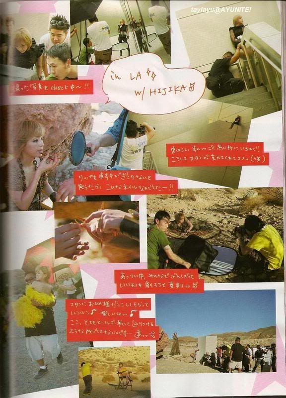
Last edited by Ayumiko; 6th December 2007 at 09:10 PM. 
|
| Tags |
| 浜崎 あゆみ, 浜崎あゆみ, guilty |
|
|
 |


 Threaded Mode