
|
| · Ayu's Official Site · Ayu's twitter · Ayu's YouTube · masa's translations · Misa-chan's translations · |
|
|
|
#1
 12th November 2006, 05:37 PM
|
||||
|
||||
|
Very nice work, Alanchan, though your amazing wings are bit too fancy for the plain background. But your first cover would've been perfect.
Stop messing with the covers, guys! You're making me find more things wrong with the original! 
|
|
#2
12th November 2006, 06:29 PM
|
||||
|
||||
|
IMO, the gift of graphic editing is sort of like a curse. LOL
[Now, I imagine what we'd be cooking up with I am.. and its terribly boring font at the time.. Haha.]
__________________
|
|
#3
12th November 2006, 06:49 PM
|
||||
|
||||
|
Alanchan, your last cover is REALLY nice. If it were bigger I'd print it out & use it when the cd came out
 ~ What depresses me, is how long did that take?? Why couldn't avex have taken a few minutes to get a designer to put that together? Especially since they really do have good material to work with; the photos are nice. It's not like they'd be asking Me Company to do another forgiveness cover. It wouldn't take long or cost much at all. Just embellish it a little. Ayu is one of their flagship artists, they should give her a little more TLC. ~ What depresses me, is how long did that take?? Why couldn't avex have taken a few minutes to get a designer to put that together? Especially since they really do have good material to work with; the photos are nice. It's not like they'd be asking Me Company to do another forgiveness cover. It wouldn't take long or cost much at all. Just embellish it a little. Ayu is one of their flagship artists, they should give her a little more TLC.
__________________
Twitter: @deliriumzer0 Ayumi Hamasaki Song-A-Day 2015 (new ayu wiki site thing, work in progress, don't click yet)
|
|
#4
12th November 2006, 07:02 PM
|
||||
|
||||
|
I think there was probably a reason for all of this, design-wise..
Why exactly, I don't know. I mean, look at I am.. the shoot was amazing, but it was sort of just "Hi, I'm some generic serif font. :<" I don't think avex has ever really given Ayu a complicated font on an album cover.. maybe RAINBOW, but that's about it. MY STORY had some engravers font and Duty had some default cursive-y font.. :O I mean, they probably tried it with many different fonts and maybe Ayu chose this one?
__________________
|
|
#7
14th November 2006, 09:41 PM
|
||||
|
||||
|
I like the CD+DVD version a lot more.. but I hate the font. It looks generic XP
__________________
 Thanks to Chris Kay for the lovely sig! You see, I want to sing this song, not for just anyone Endless Story - Yuna Ito
|
|
#8
15th November 2006, 10:08 AM
|
||||
|
||||
|
I am... and Memorial address have plain fonts too..
At least, I think so.
__________________
|
|
#10
15th November 2006, 10:41 AM
|
|||
|
|||
|
Quote:
I think spacing is a problem here. plus, the title is too large for the cover anyways compared to I am.. and Memorial Address.
__________________
Got Ayu? 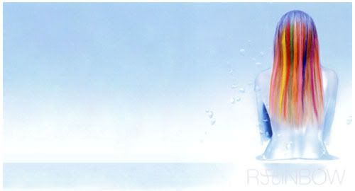
|
|
#11
15th November 2006, 10:37 AM
|
||||
|
||||
|
Are you sure about that? I'm sure that if we got those covers now, people would say: "Why is it so plain? o_o I am.. deserves more than this!"
We only say that it's okay for the older releases because we're so used to them already, right? [I still think it's not as bad as.. STEP you's font/color choice..  I forget that this is the cover.. D:
__________________
Last edited by truehappiness; 15th November 2006 at 10:40 AM.
|
|
#13
15th November 2006, 10:47 AM
|
||||
|
||||
 <3 She was no.1 on Neowing, but GLAY had like 4-5 releases which bumped everyone down D: Anyway, I think that the font will eventually grow on you.. just like the (m)u covers .. eventually grew on people. D:
__________________
|
|
#14
15th November 2006, 10:50 AM
|
|||
|
|||
|
lol, I'm still afraid to look at my (m)u covers, after a year now... now that I think about it, I haven't even glimpse at it since I bought it~
but congrats on the number 1s.
__________________
Got Ayu?
|
|
#15
15th November 2006, 10:49 AM
|
||||
|
||||
|
(m)u never grew on me, I'm still equally disgusted by them.
Secret has been number one on HMV for weeks now, seems promising. http://www.hmv.co.jp/index.asp
|
|
#16
15th November 2006, 10:53 AM
|
||||
|
||||
|
Perhaps it's because I have that poster in my room.. D:
Oh well. I just think that we're all making too big of a deal out of the covers. I mean, we could've gotten THIS again..  I am thankful that Leslie Kee came back. Like, seriously, I don't think even a bad font could trump .. that.. I think it's weird that the art director for all Ayu releases has been the same for like, the past 3-4 years.. [and by 'grow on you' I guess I meant.. you've gotten used to them? D:]
__________________
|
|
#18
15th November 2006, 10:56 AM
|
||||
|
||||
|
Somehow, I think it was intentional to be.. like that.
But we'll never know. :<
__________________
|
|
#20
16th November 2006, 02:24 AM
|
||||
|
||||
|
Any idea where it's from?

__________________
|
 |
|
|
 |


 Initiate


 Hybrid Mode
