
|
| · Ayu's Official Site · Ayu's twitter · Ayu's YouTube · masa's translations · Misa-chan's translations · |
|
#61
 5th April 2024, 03:54 PM
|
||||
|
||||
|
Quote:

|
|
#63
5th April 2024, 04:19 PM
|
|||
|
|||
|
the sneak peek looks cool! I'm glad that the animation video on Minna no Uta is not the 'actual' PV because tbh it's quite underwhelming. I'm excited to see the rest of the video - is it really sign language in the choreography?
 Quote:

|
|
#64
5th April 2024, 04:50 PM
|
||||
|
||||
|
Quote:
Even though, I don't think a font must be interesting to have a good cover: A ONE had a simple font, but it's one of her best cover to me. Speaking of BYE-BYE, I think it works, but nothing to write home about. AT least is not jarring as 23rd MONSTER's cover.
|
|
#68
6th April 2024, 02:22 AM
|
||||
|
||||
|
I was like... where have I seen this concept of chairs but better executed... and then I remember:
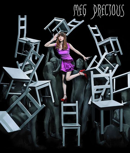  Ayu's looks like a scene from Batte Royale.
__________________
I'm back! as of 2018.09.16  Spoiler:
Last edited by minkAYuko; 6th April 2024 at 02:26 AM.
|
|
#69
6th April 2024, 09:22 AM
|
||||
|
||||
|
【滨崎步】浜崎あゆみ・新曲『BYE-BYE』NHK Ver. 先行试听~みんなのうた~
https://www.bilibili.com/video/BV1VZ..._more_video.-1
__________________
|
|
#70
6th April 2024, 01:00 PM
|
||||
|
||||
|
Quote:
The concept is not really the same. This is more theater and Alu is just simple graduation/shool-whatever as there are school kids in the video and the song obviously speaks to a younger audience. As for the font discussion: I think fancy fonts are the worst thing on CDs and other media. They are 90% miss and rarely add anything. The only time this passes for me is, if there is a consistent font choice (like for Manga-series and s so on; Mika Nakashima also does a really great job at it and it always bothers me if they don't decide to do it at all- in rare occasions) and not jumping from one cover to the other. Aye had this with her A and they should have simply build around it for her whole career, keeping it simple. That said, a simple white font aesthetically is the most fitting they did in the last few years.
__________________
awsome SET made by Foxxy_Fuyumi l ~**My HQ-MV CAP COLLECTION THRAD**~ l ~**My HQ-Audio Live Rip COLLECTION THRAD**~
|
|
#71
6th April 2024, 02:43 PM
|
||||
|
||||
|
The cover is really pretty! I like the song as well, can't wait for release day. It's interesting that she's doing this style (sound) now as she never did it originally in the late 90s / early 2000s. But it's nice to hear something different from her.
|
|
#72
6th April 2024, 08:33 PM
|
||||
|
||||
|
Quote:
...and i rly didnt get the vibe of this song  supposedly i'm not the targeted audience supposedly i'm not the targeted audience
__________________

Last edited by brener; 6th April 2024 at 08:37 PM.
|
|
#73
6th April 2024, 11:17 PM
|
||||
|
||||
|
Quote:
__________________
awesome set by Aderianu ♥ happy 14th anniversary to 浜崎あゆみ! (1998.04.08) ♥
|
|
#74
7th April 2024, 07:50 AM
|
||||
|
||||
|
Quote:
__________________
 My Ayu's page Facebook - Ayu Paradise|My Instagram|My [Books] Blog Set made by Me
|
|
#75
7th April 2024, 08:53 AM
|
||||
|
||||
|
This song got ourselves vibe
|
|
#76
7th April 2024, 10:31 AM
|
|||
|
|||
|
Quote:
As a person who started the topic I should clarify more. The problem is not just a font but the whole desicion of typography. The position of title (to put in the lower right angle) / the thiness / the color / the vertically scale Ayu has a lot of CD cover which feature normal fonts like NEVER EVER, STEP you/is this LOVE? but the boldness of alphabet, the color that goes well with background or color scheme, or the position of the title - it makes the cover looks simply good and outstanding without to be fancy. Even MADE IN JAPAN that looks like a watermark on a licensed photo, it's still good because they put the title in the center of the picture.
|
|
#77
7th April 2024, 10:57 AM
|
||||
|
||||
|
Quote:
but see, I really like how it looks and where it is positioned. I dislike font that goes across the picture or is placed somewhere in the middle (23rd Monster, A Ballads 2). And looking at the current example, the font checks everything I like. It has a good position, it is alldingend, it looks simple and every other placement would have been to playful for me ( I could see it on the bottom in the middle tho). The only thing that bothers me that they are switching up the font and size every time. edi: STEP you is a good example of why a font should be simple and white. It hurts the eyes, it is barely readable and for me it is too big (yet it works cause it looks like a glamour shot)
__________________
awsome SET made by Foxxy_Fuyumi l ~**My HQ-MV CAP COLLECTION THRAD**~ l ~**My HQ-Audio Live Rip COLLECTION THRAD**~
|
|
#78
7th April 2024, 04:07 PM
|
||||
|
||||
|
__________________
 LIVE: TV VERSIONS | all a-nation performances | A -Vocal tracks- a-nation audio rips | AYUMI ALL SCANS TEXTLESS | 25th Anniversary Museum ~A WORLD IS ONE~
|
|
#79
7th April 2024, 04:16 PM
|
||||
|
||||
|
Her face really bothers me in this new PV... She kinda looked normal again last year, and now it's almost scary ��
The song is good though, catchy and refreshing! If she drops an album in the same direction, it should be a good one!!
__________________
~ since 2005 ~
|
|
#80
7th April 2024, 04:28 PM
|
||||
|
||||
|
It has something from the Return Road Live 2020 I think it was, with all the fingers pointing towards her? Reference to her school time being an outsider? Then I am asking myself whether she is deaf or pretends to be deaf because no lip synching in the class, only when the time has stopped or being alone...questions and more questions..
|
 |
|
|
 |


 Initiate


 浜崎あゆみ
浜崎あゆみ  Initiate


 Linear Mode

