
|
| · Ayu's Official Site · Ayu's twitter · Ayu's YouTube · masa's translations · Misa-chan's translations · |
|
#221
 26th November 2011, 05:44 PM
|
||||
|
||||
|
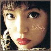
Like the May-June shoot. But that's all. The rest of the pictures aren't that wonderful.
__________________

|
|
#222
26th November 2011, 08:23 PM
|
|||
|
|||
|
i love this calendar! my most favorites are the may-june & july-august pictures.

|
|
#223
26th November 2011, 08:40 PM
|
||||
|
||||
|
I like everything except the first and last picture, those two are cheesy.
|
|
#224
26th November 2011, 09:43 PM
|
||||
|
||||
|
Finally <3 I actually love it *o* except from nov-dec all of the pictures are great imo.. Maan really have to order it this year too haha :'D
__________________
What I wanted to have? Was your smiling face.
|
|
#225
26th November 2011, 11:16 PM
|
||||
|
||||
|
I think both 2003 and 2012 has some bad pics and good pics. So I don't think one is better then the other.
For example Ayu did a better pose in May-June 2012 then the May-June 2003. The outfit she had in Nov-Dec 2003 compare to the one she wore in Nov-Dec 2012.
|
|
#226
26th November 2011, 11:27 PM
|
||||
|
||||
|
2012 win 4 photos 2011 one win 2 so it's 2012 for me
 glad i'm getting it. glad i'm getting it.
|
|
#227
26th November 2011, 11:31 PM
|
||||
|
||||
|
She looks great in all shots except for the last one. I don't like her figure in that one.
__________________
My posts often contain OPINIONS! (: DISCOGRAPHY ayumi hamasakiDISCOGRAPHY shoko nakagawa DISCOGRAPHY kyarypamyupamyu
|
|
#228
26th November 2011, 11:57 PM
|
||||
|
||||
|
So glad my birthday is in April right about now. I love her softer pictures. The others all look over worked and over stylised. Ayu doesn't need all that much to look flawless. I prefer the much more natural and relatable Ayu to be on my wall. 2011 calendar was boom ting though.
|
|
#229
27th November 2011, 12:16 AM
|
|||
|
|||
|
I really like it!
|
|
#230
27th November 2011, 12:23 AM
|
||||
|
||||
|
Gorgeous.
__________________
|
|
#232
27th November 2011, 02:56 AM
|
||||
|
||||
|
I prefer the old one, because it's more natural (I especially love the one in the fur coat). What strikes me the most is that although Ayu hasn't changed drastically over the years, the difference in her face is not the age, but the make up, which is so obvious that it tells you its purpose for being there is to make her look younger.
It doesn't. It makes her look like someone who's trying to look young, which I believe she would if she wore less. I like to see people age, as it gives them more character. I also believe it's possible to look a lot younger than you are--my mother is the living proof of that. But I don't like it when people do all sorts of things to look younger and get the opposite effect, and for that reason, appear desperate. From an aesthetic point of view--she's pretty. But she lacks character, especially when you compare these two calendars.
__________________
Last edited by letter; 27th November 2011 at 03:00 AM.
|
|
#233
27th November 2011, 03:10 AM
|
||||
|
||||
|
To be honest, I don't see this natural thing in the 2003 calendar as other people do
 . .The previous one looks pretty fake-plastic-colorful as well lol but I think it's done on purpose. And that's why I like them both. If I'd call natural a calendar I'd pick the 2004 or 2006 ones.
__________________
|
|
#234
27th November 2011, 05:54 AM
|
||||
|
||||
|
I think her most natural calendars were probably 2001/2002, and then maybe the one set in Hawaii.
All of the other ones are pretty much glam!Ayu with crazyretouching. The way she had her makeup done by Keizo Kuroda back then is also rather different compared to the way that the new makeup artist does it imo. You can see the change in her general style after he and her old stylist were replaced post-(miss)understood.
__________________
Last edited by truehappiness; 27th November 2011 at 05:57 AM.
|
|
#235
27th November 2011, 06:52 AM
|
||||
|
||||
|
I don't blame the make up I blame the photoshop.
She looks normal in real life and not plastic. Quote:
They both are unique in their own way so I can't compare them. I can't say I like this one better than this because of this blah blah.
|
|
#237
27th November 2011, 10:45 AM
|
||||
|
||||

__________________
 LIVE: TV VERSIONS | all a-nation performances | A -Vocal tracks- a-nation audio rips | AYUMI ALL SCANS TEXTLESS | 25th Anniversary Museum ~A WORLD IS ONE~
|
|
#239
27th November 2011, 01:00 PM
|
||||
|
||||
|
The Mar-Apr and and Sept-Oct ones are beautiful, and I'm curious how the rest will look in HQ. The last one made me lol and the first one would be better without the red Statue of Liberty-text. "Ooh! Tell me, who is that beautiful, beautiful woman who has her hand raised, in this picture?" "Well, you must be talking about The Statue of Liberty!"
__________________
BRILLIANCE
|
|
#240
27th November 2011, 01:42 PM
|
||||
|
||||
|
Quote:
@kazeyomi and truehappiness: Personally, I'd say the natural thing comes from the fact that she isn't trying nearly as hard in the 2003 one. Yeah, there's a ton of makeup, but it's still don't pretty effortlessly and naturally... She doesn't at all look like she's trying hard to look good, and more importantly, her poses are really natural and unforced, as if she's not really even trying to pose. In the 2012 one, she is posing to the extreme and obviously trying really hard to look younger than she is, which makes her look older. @_@
|
 |
| Tags |
| 浜崎 あゆみ, 浜崎あゆみ, calendar 2012, leslie kee |
|
|
 |


 it's a great tribute to the 2003 one!


 Linear Mode

